OUR BRAND
Building a strong brand isn’t easy – it takes time and consistency. That’s why it’s important for Power Design employees, customers, vendors and members of the community to be able to clearly identify our brand.
We don’t expect you to know exactly what logo, color, or font to use in every situation. These guidelines are here to help, but always be sure to reach out to marketing when a question or a need for branding arises.
Our logos:
The Power Design logo is the clearest visual representation of our brand. It’s often used on presentations, documents, apparel, ads, signage, and more! Our preferred logo can be downloaded here.
Please remember:
- Never send or release our logo to an external party without prior approval from Marketing.
- You may NOT change the color of the logo or distort it in any way.
Need a different logo? Contact your department/team’s executive assistant or the marketing manager for help!
Our colors:
Our color palette is a big part of our brand. That’s why it’s so important to use our colors properly!
For more details about our approved colors, check out our Brand Guide!
Our font:
Everything coming from Power Design should look consistent. That’s why we use the same font, company-wide. Calibri is our official font for all day-to-day communications, like documents and presentations.
Our voice:
Power Design isn’t your average contractor, and the way we talk about our company should reflect that! Check out our Brand Guide for details on our writing style and contact the marketing manager if you have questions.
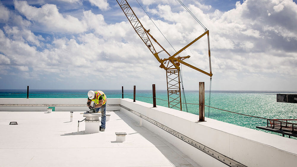
Photography and videography:
Need photography or videography services? Fill out the request form!
Contact the marketing manager if you have any questions.
Document templates:
Branded templates for our most commonly requested assets – presentations, letterhead, org charts, and more – are available on the document templates page!
